Modeling Epidemics - First Steps with Agent-Based Modeling Pt. 2


We spent the last post discussing principles of agent based modeling, and the basic layout of the model I have initially created. Now it's time to see some results! All of the code used to generate this model can be found here.

First off, I want to talk a bit about the approaches which I have taken towards the visualization of my model, as well as the inadequacies of these approaches. In the previous post, I discussed the fact that my model is based upon the usage of networks (graphs) for the mapping of social interactions. My first approach to visualization (particularly during the development process) was plotting these networks, as this allowed me to see how the disease was spreading in my model, and debug. This worked well during the testing phase, when my model population was rather small; however, when I scaled up the model, this technique did not work as well.

Example Small World Graph 
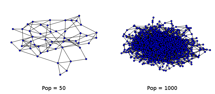
Two example small world networks generated and drawn by the networkx library in Python. As the number of nodes increases, ease of interpretation decreases dramatically. The graph on the right is often referred to as a hairball.

Nonetheless, I have yet to find any better way of displaying the change in the nodes of my network over time. There are other software out there which are better suited to the display of graphs (and allow for greater interactivity), but I have yet to spend much time exploring them. I am particularly interested in two softwares: Gephi, which is a Java based software built for the purpose of both analyzing and visualizing graphs; and sigma.js, a browser-based Javascript library built for the purpose of visualization.

Network Animated GIFs

For now, I have harnessed a technique I have leveraged in a previous project in which I analyzed of US Senate data. I utilize the ImageMagick "convert" command-line tool in order to combine a series of static images into an animated gif (example here). For my network, I animate the nodes as they change color to indicate their infection state. The vizualization is a bit chaotic, but I think it looks real neat.

Animated Network Graph 
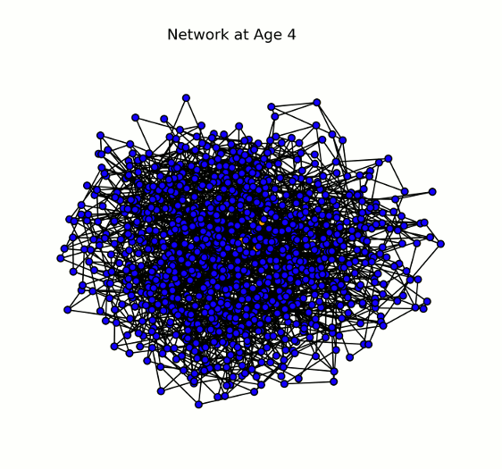
Animation displaying the spread of the disease through the network (# nodes = 1000). Each node (or individual) can have one of four states for a given pathogen: susceptible (blue), infected (yellow/orange), recovered (green), or dead (red). Here we show a single pathogen system.

Read more...

Modeling Epidemics - First Steps with Agent-Based Modeling Pt. 1


For those who have been reading along with my past couple of blog posts, you've seen me explore different means of utilizing computational modeling to explore epidemic dynamics. In my last two posts (here and here), I developed a basic set of scripts (in R and Python) which apply a series of simple formulae to model aggregate/bulk infection dynamics in a population. In this case, the model is considered deterministic: meaning that my outcome will be the same every time I run the model.

Now, these mathematical/deterministic models can be useful for approximating the general outcomes of an outbreak, however they can fail to capture the nuances which might be present in a more complicated model. There is less flexibility in this kind of model to alter population or disease behaviours without completely redefining our equations. This is not to say that such models cannot be created, simply that I do not have the expertise or know-how to do so.

Instead, since the beginning of this project, my intention has been to utilize agent based modeling (ABM) as a tool for exploring epidemic dynamics. Just to restate what I discussed in this post, an agent based model does not utilize formulas to model epidemics; instead, the modeler must design agents (objects in an artificial/simulated world), define how these agents interacts, and when they interact. The simulation is then run, and the outcome determined at the end. Typically, these simulations incorporate some degree of randomness, so no two simulations will have exactly the same results (provided the random number generator seed is different).

Read more...

Modeling Epidemics - A Shiny New SIRD Model


In my last post I presented the formulas which I will use to mathematically model SIRD epidemic dynamics. I also presented some preliminary R and Python code which could be used to simulate these equations over time and plot the results.

Overall I thought that this was a neat exercise, but was altogether a bit boring for you, my readers. I wanted to get you involved, and allow you to play around with the parameters being entered into these equations. I've also been really interested in the development of interactive graphics for displaying data of late: I think that it's one thing for a statistician to tell a reader what they should think about a dataset, and another for the reader to actually examine the data, and draw their own conclusions. This is valuable because, in reality, it's very easy for a savvy statistician to manipulate a graphic to tell the story that they want to tell; allowing the user to examine the data in depth, and play with the axis can mitigate this issue to some extent.

Interactive Plotting Technologies

I've been doing some research into interactive technologies for plotting (particularly Bokeh, pure d3.js, and mpld3). I actually won't be using any of these technologies in this post, but I hope to use them sometime in the near future. Instead, I've fallen back on an old friend, Shiny, which I have used in the past to create interactive analysis platforms. In particular, I've used Shiny for an organization where I served as Director of Research. Our volunteers would fill out a reflection at the end of each of their shifts; this data was then organized and presented to shift-leaders using a dashboard I designed and developed in Shiny, which would automatically pull the latest data. This technology allowed shift-leaders to track their shift's progress and efficacy, and was also used to guide our quality improvement (QI) initiative.

For those who are not familiar with Shiny, it is a platform built on top of the R programming language, which allows for the generation of user interfaces (displayed in the web browser). These interfaces interact with a server-side R script which receives parameter updates and produces outputs (tables, plots, etc.) which are then sent back to the user. Notably, unlike some of the technologies I mentioned in the last paragraph, Shiny requires a back-end (a Shiny server); this allows for the creation and updating of information on the client-side. If this explanation is not particularly clear to you, perhaps this project will serve as a good example of what Shiny can do.

Read more...

Modeling Epidemics - Mathematical Models in R and Python


In a previous post I spoke about two major approaches to modeling epidemics: the mathematical model and the agent based model. Here I detail the development of a mathematical model using two lagunages: R and Python. I hope to use these model in order to provide a point of comparison for the dynamics of the ABM model which I will be building.

First Steps

I did a lot of reading and research before getting started on this project. Though I had a conception of how to approach the problem of designing a simulation, I had little practical experience or insight. I began by implementing a standard SIR model in R quite a while back. I have upgraded this model and written a similar mode in Python.

In both my mathematical and ABM models, I utilize a SIRD (Susceptible; Infected; Recovered; Dead) compartmentalized type model, which is a simple representation of disease progression with discrete states. When approaching modeling mathematically, we utilize a set of equations to describe bulk population dynamics:

Equation for # susceptible individuals Equation for # infected individuals Equation for # recovered individuals Equation for # dead individuals

where β = infection rate; γ = recovery rate; and μ = death rate.

Read more...

Pebble Time - He's Dead Jim


Well, the boot-loop has finally stopped taking over my watch; at least somewhat. Now I've got the boot-loop some of the time, and an error which stays on screen for a bit. I had actually seen this error screen before, but it always disappeared before I got a good look at it.

Pebble Time Error The error and code displayed on my watch. You can also see my new watch-skin, I think it looks real nice. Too bad I'll probably have to replace it with my watch.